Art in Architecture
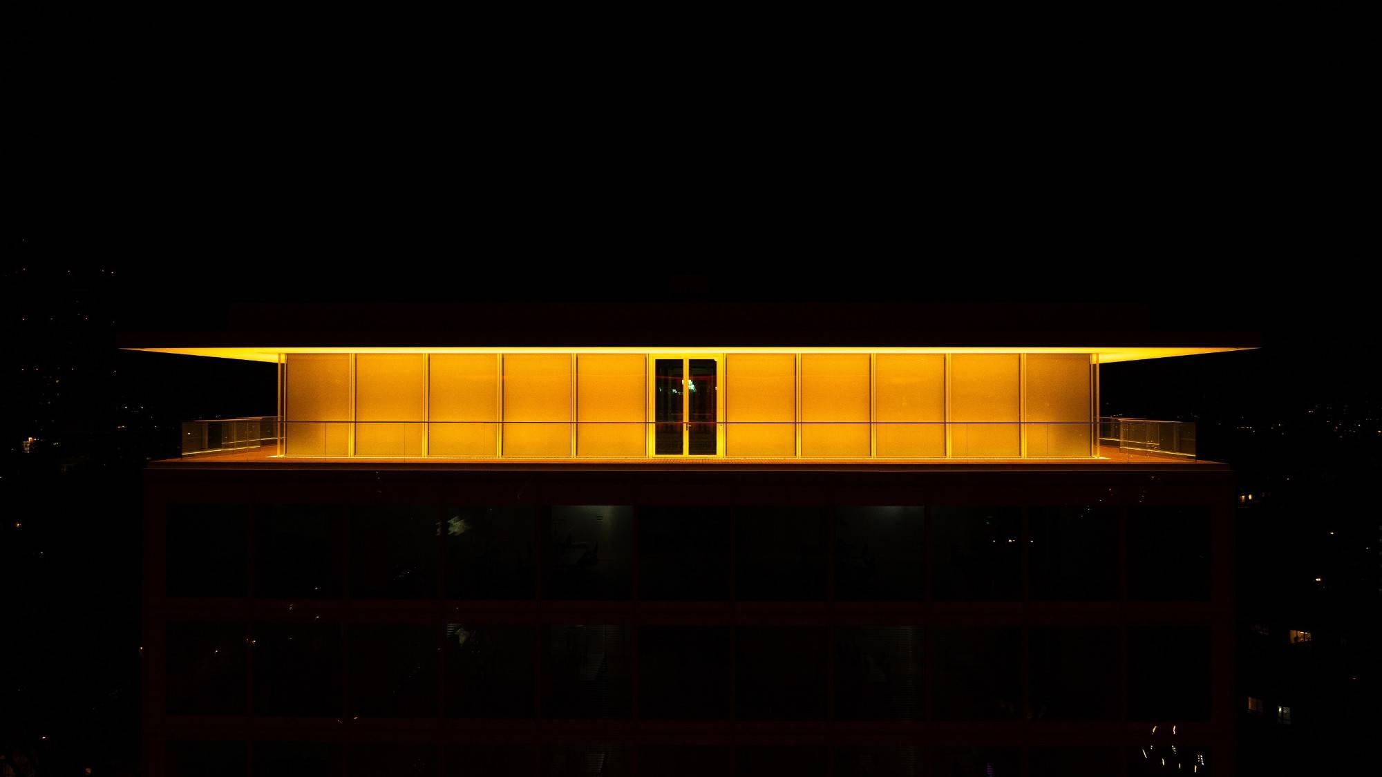
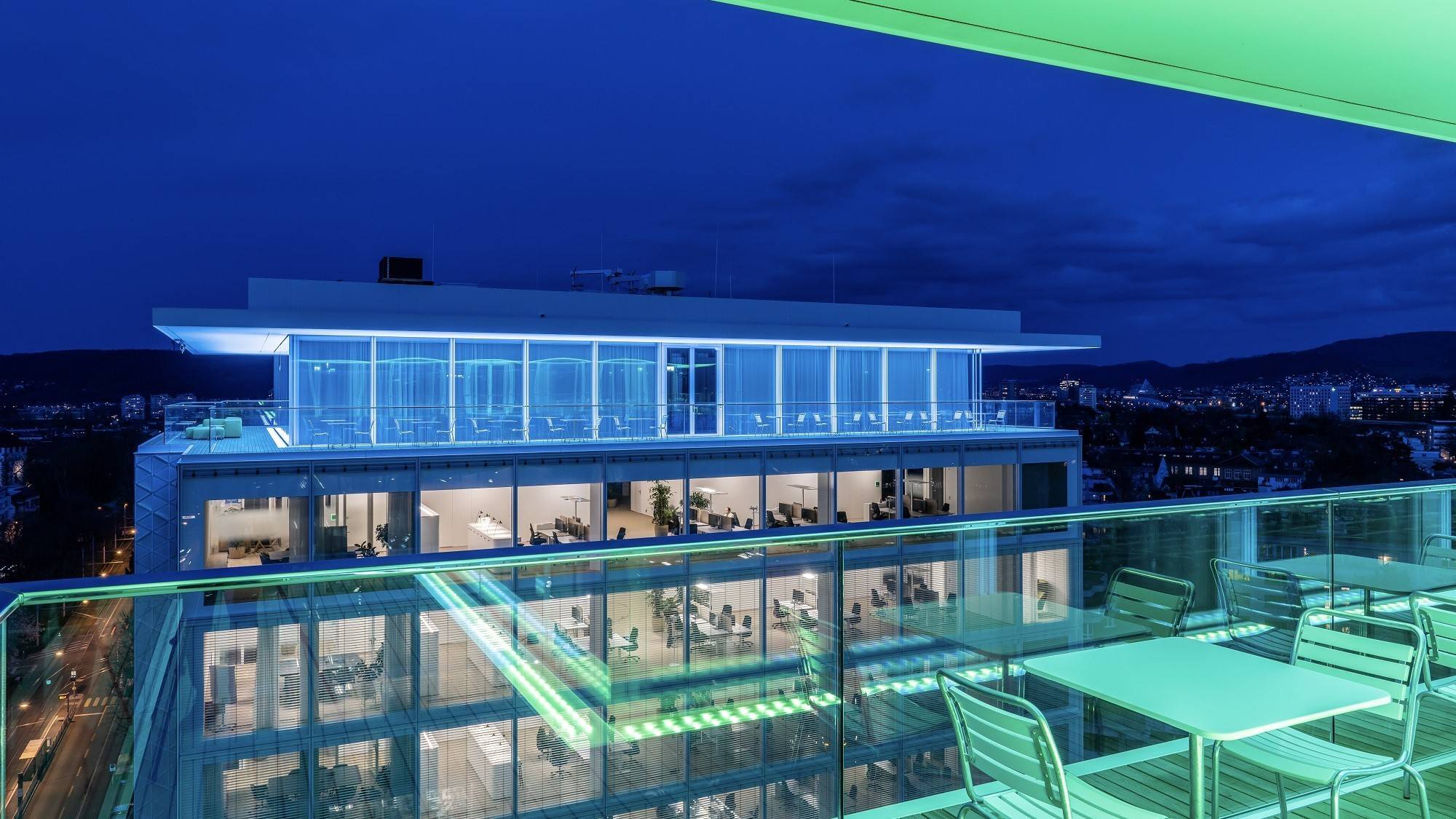
Two lighthouses for the city of Basel
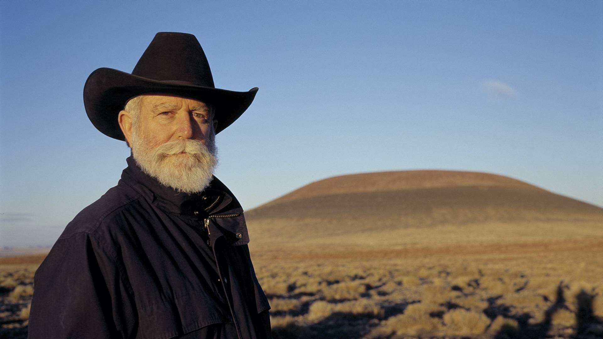
The roof cornices of the Helvetia campus are the virtual canvas for James Turrell's work "Light Raiment 2024". More than 20,000 LED lights bathe the buildings in atmospheric light in a barely perceptible change of colour. The lighting is reflected from the underside of the roof and the glass façade, blending with light from the interior and allowing colours and spaces to merge with each other. The two towers are clad with around 24,000 hand-cast glass tiles, and their façades add an additional dimension to the light show. The installation will be on display from sunset until the Bistro closes.
Clarity 2023
At the entrance to the West Tower, which is also where the Helvetia Art Foyer is located, visitors can admire another work of art by James Turrell: Clarity 2023 from the "Diamond Glass" series. A special feature of this work is the diamond motif, which can also be found in Herzog & de Meuron's façades and numerous other architectural details on the campus.
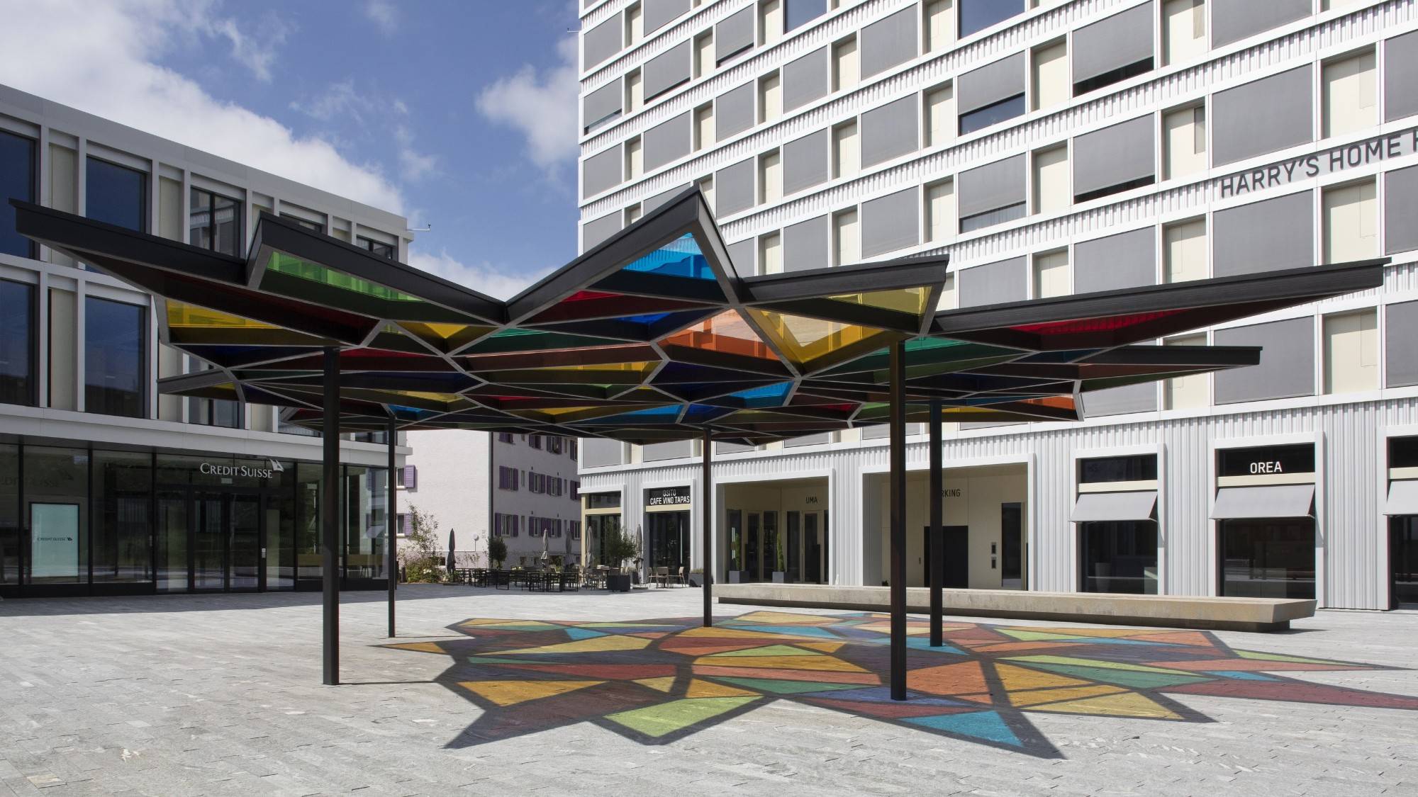
URSINAE – reaching for the stars
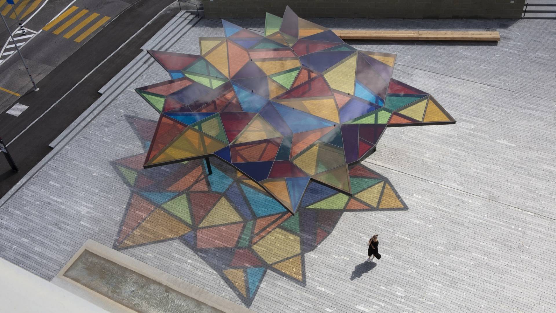
URSINAE is the title of the 120 m2 roof of stars on Bärenplatz in Ostermundigen. When the sun shines, the colourful glass panels are reflected on the natural stone floor of the square, immersing it in a vibrant sea of colours. As the sun crosses the sky, the colourful shadows move over the square, showing the time like a sundial.
The star-shaped roof and the flowing hues were inspired by three constellations: the Great Bear (Ursa Major), the Little Bear (Ursa Minor) and Arcturus ("Guardian of the Bear" in Ancient Greece). Arcturus is also known as "Bouvier" in French, in a pleasing connection to the artist's last name. The artist was also inspired by the architecture of the Bernese Minster, with its magnificent stained-glass windows and cross-ribbed vaults, and the bear as the heraldic animal of Bern, from which the city gets its name.
The artwork URSINAE in front of the BäreTower in Ostermundigen.
Photos: © Ioana Marinescu
A gigantic splash of paint
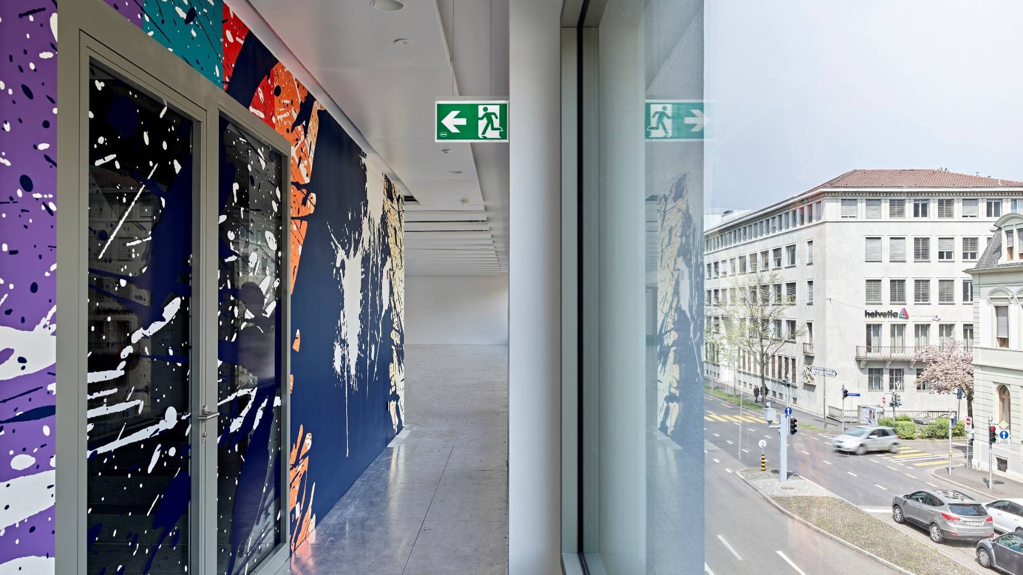
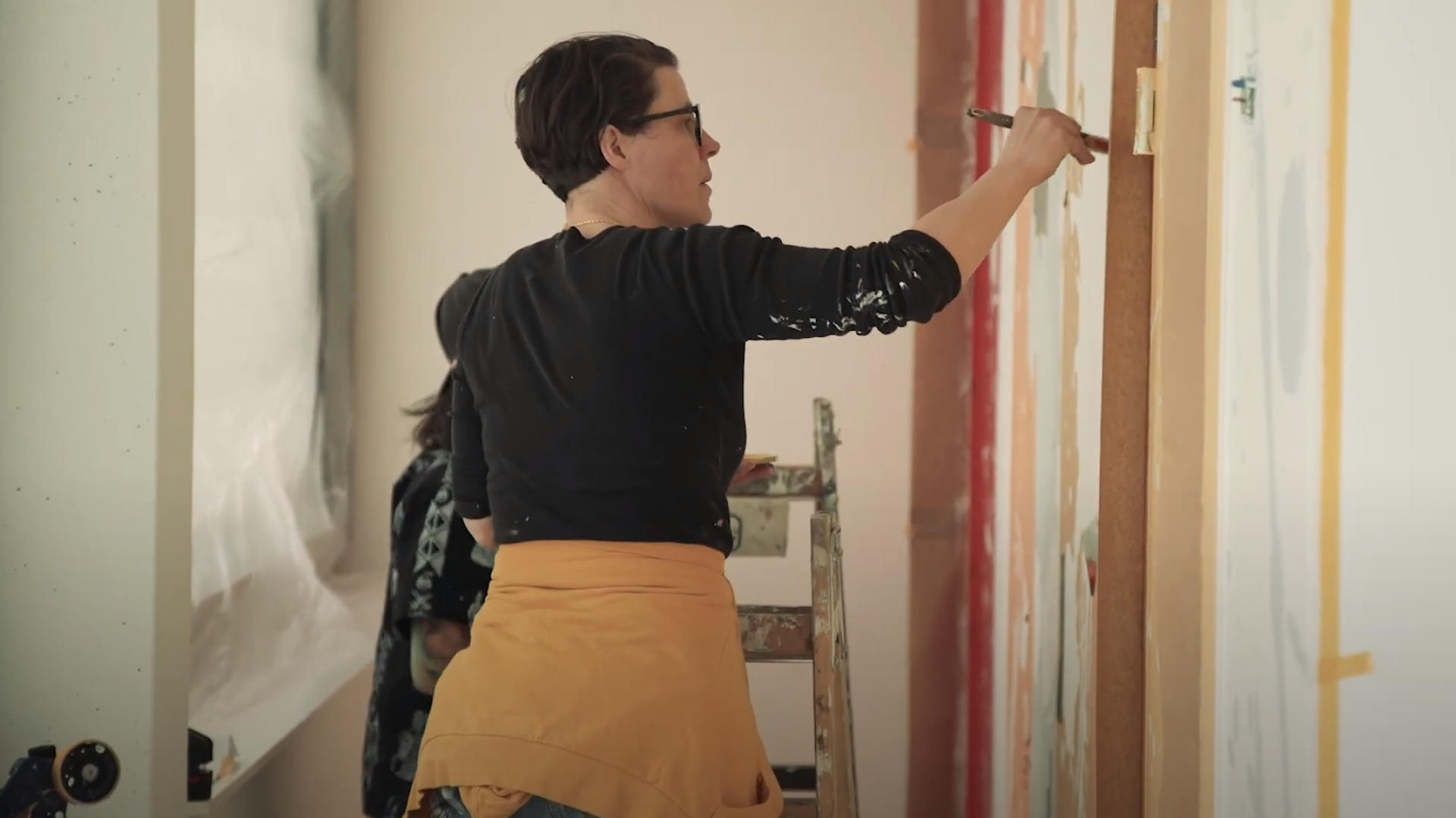
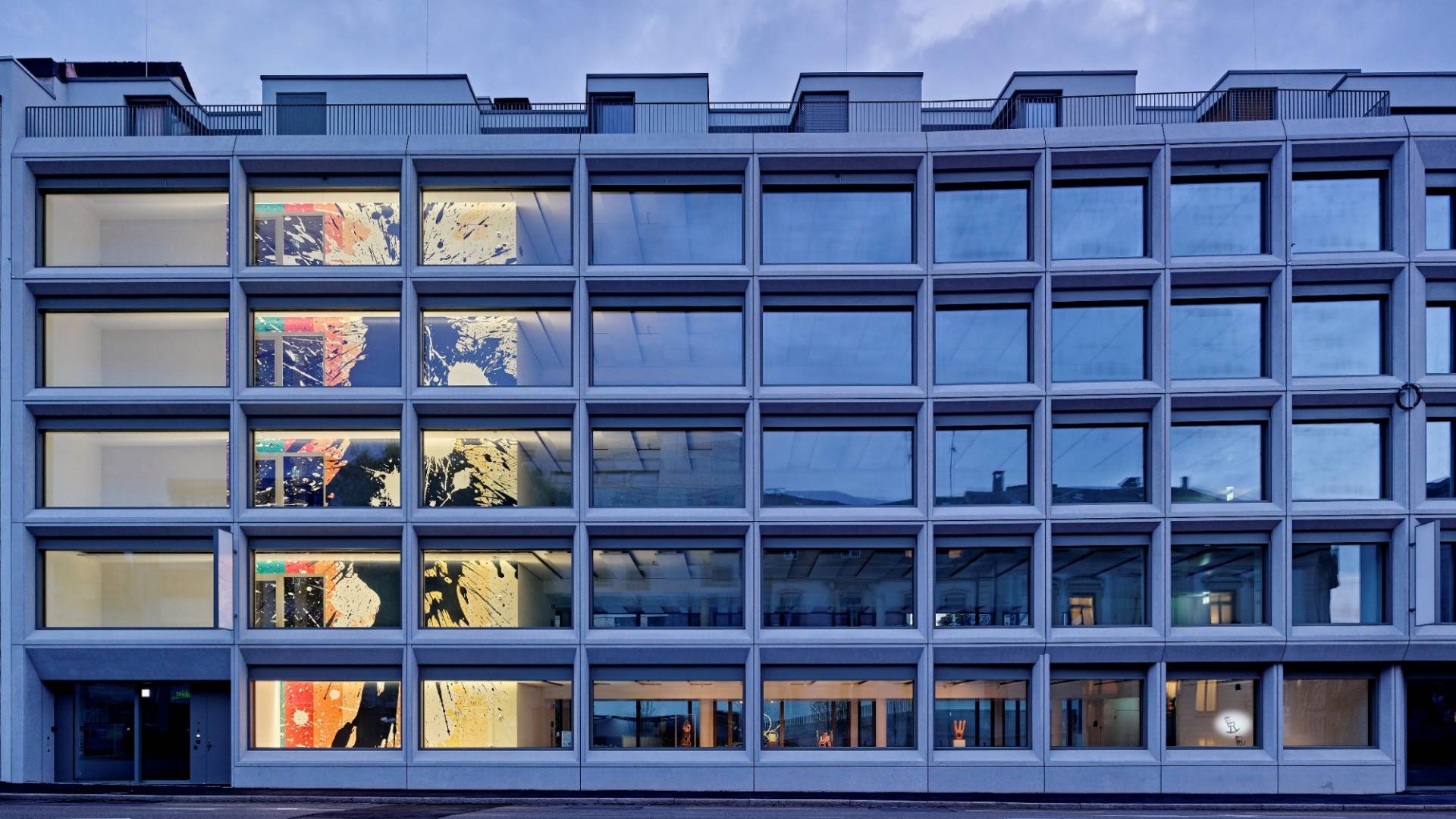
Created using a painstaking stencilling technique, the eye-catching painting stretches up over five floors. A bright and friendly vertical-stripe pattern is interrupted by a huge splash of white paint, on top of which is another immense inky blue splash. The work is entitled "Vollkasko" (Fully comprehensive). The huge splashes of colour simulate what could be the result of tipping over giant pots of paint. Spatter marks on walls are generally a sign of accidents, vandalism, soiling and damage. But colourful spatters are also an important part of the vocabulary of painting, which encompasses colour, form, gesture, energy and dynamics. The title "Vollkasko" is a tongue-in-cheek allusion to this ambiguity – after all, fully comprehensive insurance covers damage to objects that are new and usually valuable.
Counting-out rhymes in the boardroom
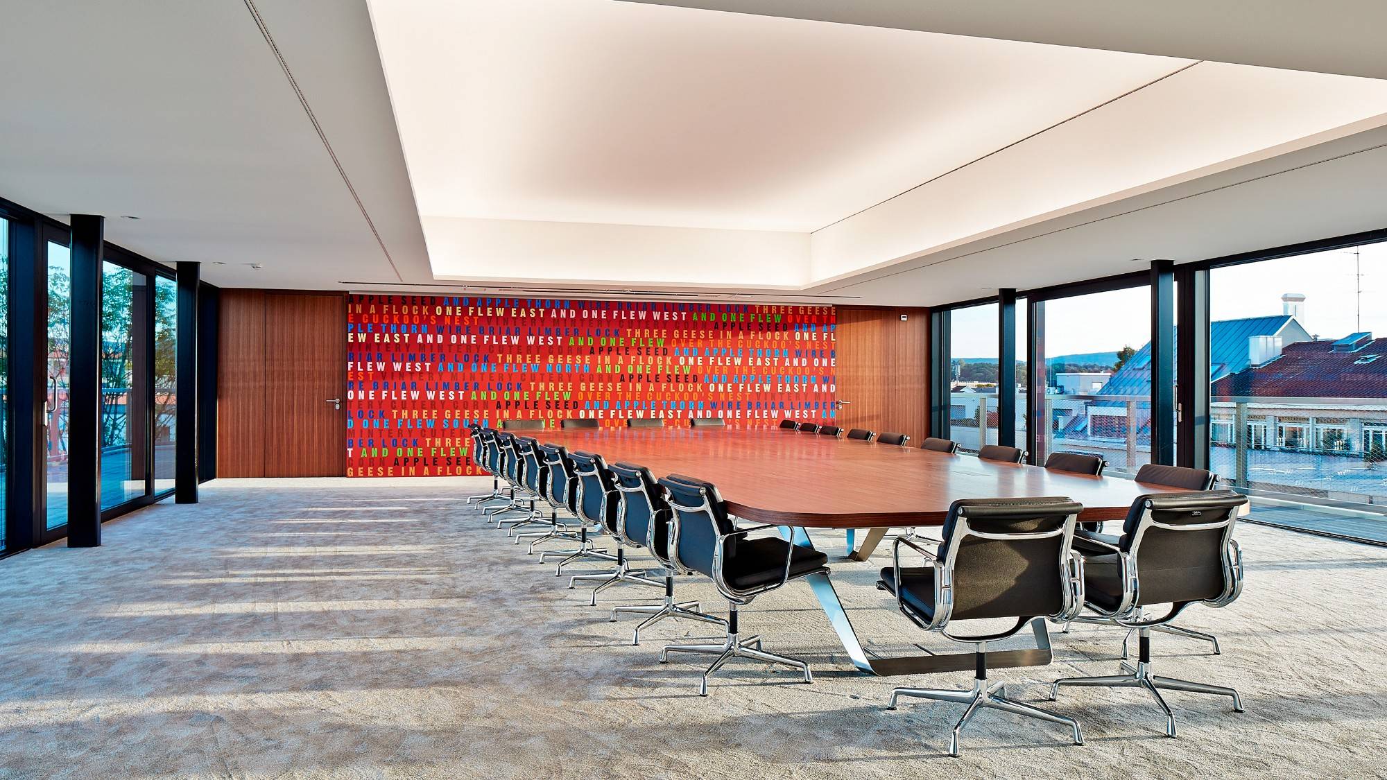
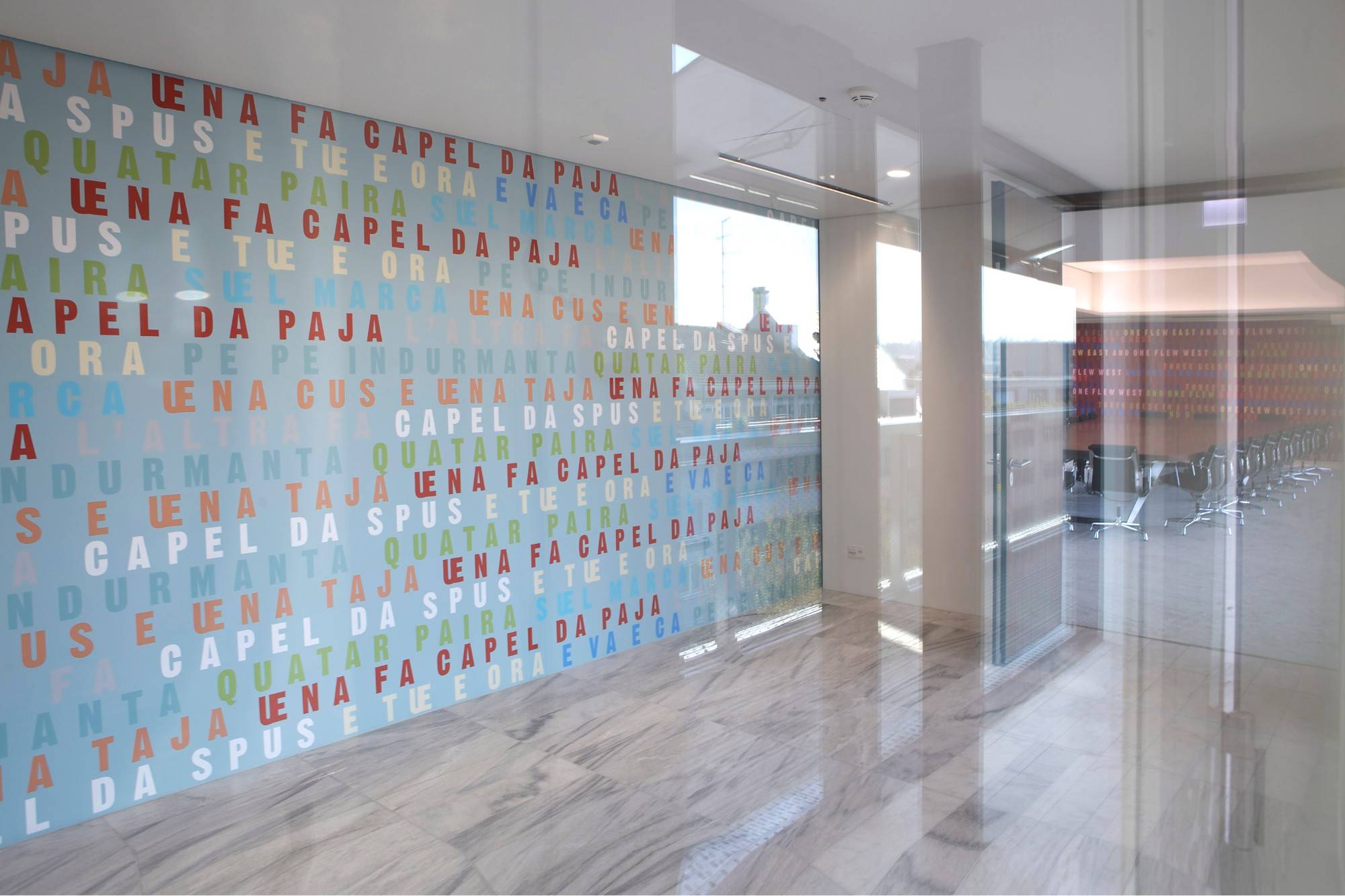
Hans Danuser's "Joggeli" art intervention extends over a total of three rooms at Nationale Suisse's head office in Basel. Beginning in the entrance hall, it then focuses on the end wall of the boardroom before continuing across the walls of the neighbouring visitors' restaurant. The work is part of Danuser's "Counting Out Rhyme Project" which looks at decision-making and makes playful reference to the role of the boardroom as a place where important identification processes take place and key decisions are taken for the company.
In this "Counting Out Rhyme Project" the artist investigates one of the oldest ways of making decisions, the counting-out rhyme. This is still often used today in many different cultures and languages. For the pictures on the walls of the entrance hall and the boardroom, Hans Danuser took one counting-out rhyme in the dialect of Val Bregaglia and one in English and transformed them into typographical images. The words cover the two walls like a rhythmical score, giving the spaces their own tonal mood and atmosphere. As light as a feather, the visitors' restaurant features the title line of Lisa Wenger's children's book, "Joggeli söll ga Birli schüttle". Here, for the first time, Danuser has used a nursery rhyme rather than a traditional counting-out rhyme.
Pyramids on the ceiling
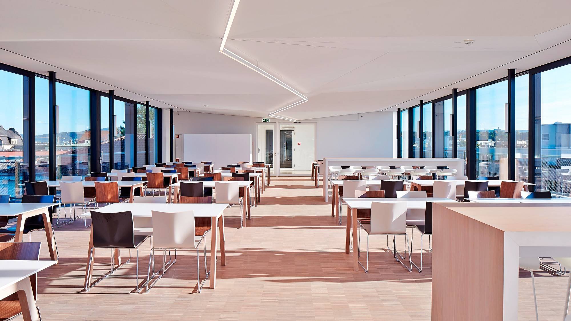
The key aspect of the staff restaurant at Steinengraben is the multi-faceted interplay between the indoor and outdoor space, between the place and its surroundings. The north-south alignment of the long drawn-out room brings in plenty of morning and evening sun through the two glass façades. This mild light falls flat on the room and varies greatly depending on the weather and the time of year. Designed by Daniel Robert Hunziker, the surfaces of the staff restaurant ceiling project this natural lighting ambience to create a poetic visual and atmospheric presence in the room.
The whole ceiling has been covered in flat, triangular pyramids whose shape, size and order follow a freely interpreted loose grid. This has produced a multitude of triangular surfaces facing in all directions that reflect the light in different levels of brightness and colour. The interplay between the sculptural shape of the ceiling and the natural light patterns gives the interior a reserved yet striking rhythm. At the same time it intensifies the dialogue between the impressive view of the city and the building's architecture.
A shower of paint in the stairwell
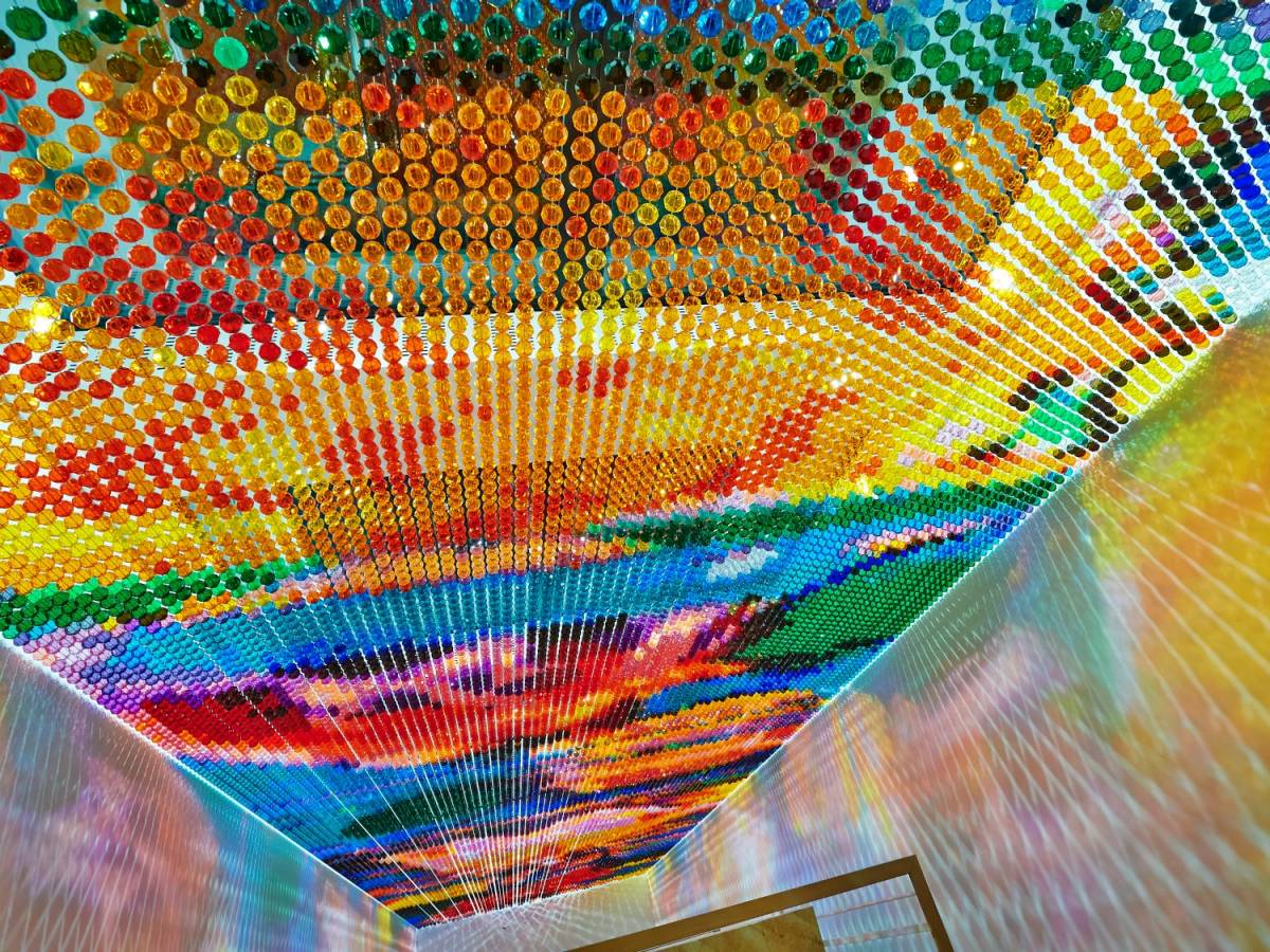
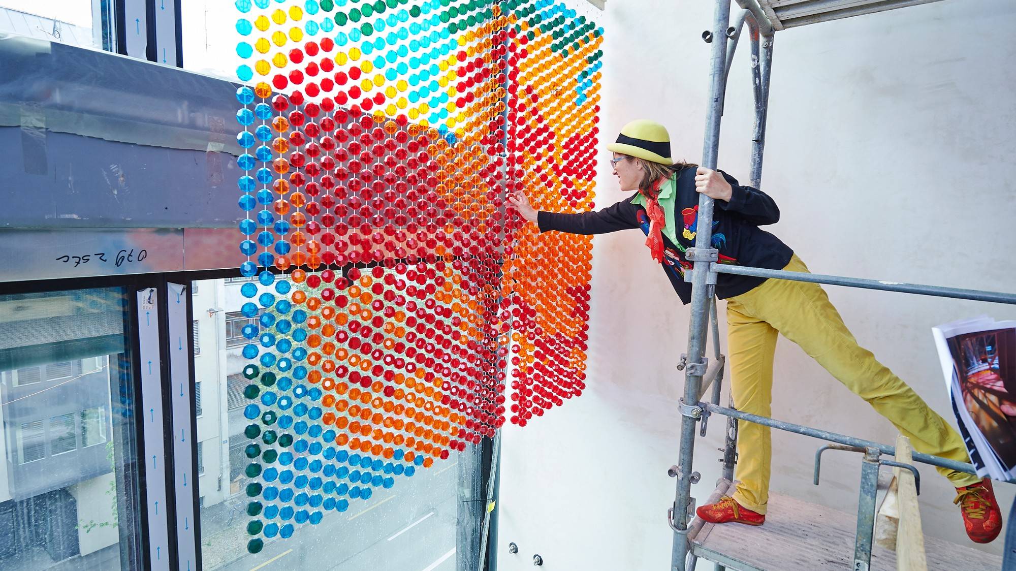
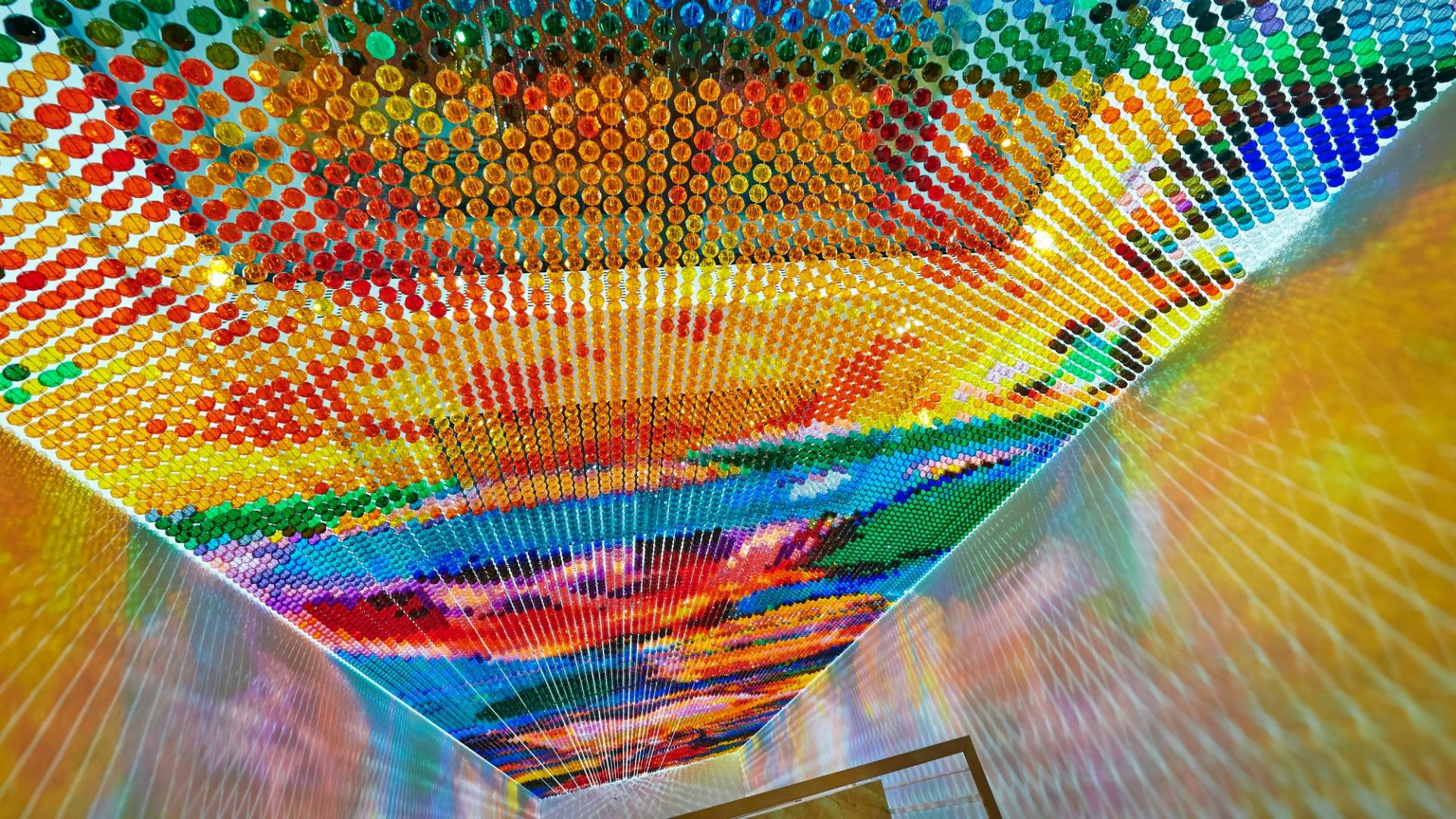
With the artistic design of the six-storey stairwell connecting an old building with a new one, Pipilotti Rist addresses the specific architectural features and creates an arch between traditional and modern architecture. The installation consists of thousands of colourful, faceted beads hung on wires which give the impression of a coarsely pixellated image. The plastic pearls form a bright curtain. When the outside light hits the beads, it throws colourful shadows onto the walls, the shapes and intensity of which vary depending on the season and the time of day. Pipilotti Rist calls this a "colour shower", which rains down, and thus connects, all six floors. The work is entitled "aufgeweckter Rosenscheitel". The artist has created a rose window – a contemporary twist on the stained glass windows found in Gothic cathedrals that bathe their interiors in atmospheric light.
A stairwell with its own timbre
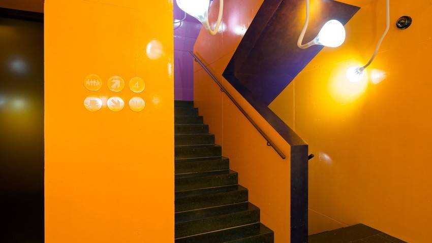
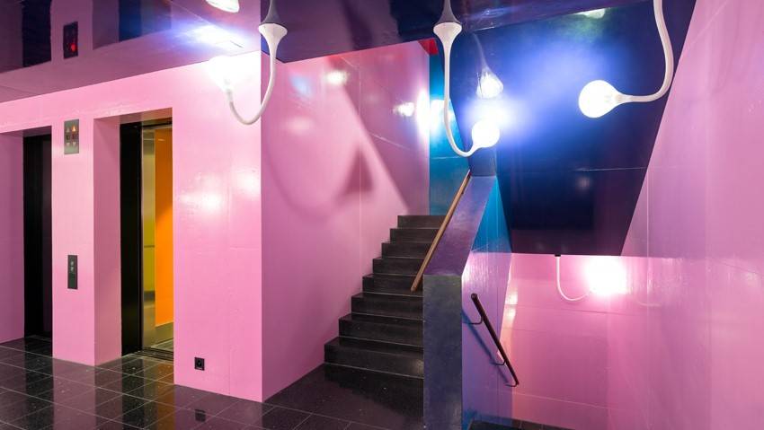
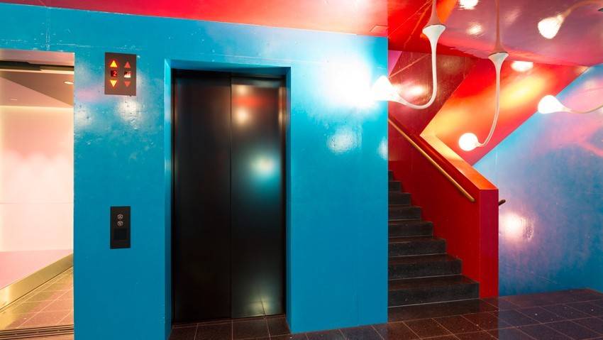
Emanating from the ground floor, the coloured surfaces stretched down to the basement and up to the fourth floor. On the basement ceiling, the paintwork flows gently into the foyer with its greenish violet colours. Affording a view into the distance with its storey-high windows, the fourth floor is dominated by turquoise, which encounters a bright violet. On the second floor, a dominant red and gaudy yellow compete with one another. The first floor is characterized by a violet ceiling and pink walls, the ground floor by orange, and the basement by dark blue.
The structures of the unpolished concrete are visible under the paint and emit an almost crude, incomplete picture. The virtually windowless stairwell has a number of ceiling lamps designed by Herzog & de Meuron which not only emit light but also playfully interact with the paintwork by minimally brightening the paint in the darkness that almost creates an effect of actually painting.
Text by Denise Frey


